
EDA on Zillow Data in Orem
Understanding the data we collect
Getting Data in the Correct Format
by Zack Driscoll
Starting Line
In this blog post we are going to tackle summarizing our data and interpreting it. It is one thing to gather, and another thing to explain. We are taking the Zillow Data that we scraped from our previous blog post and are putting it to good use here. Essentially what we did was formulate some code that allowed us to find the houses listed for sale on Zillow given a geographic location. In this blog post we are using data from houses that are for sale in Orem, UT. Follow along on your own screen using my code chunks or use your own data.
Formatting Correctly
Before we dive on into our data, we need to make sure that we are properly formatted to make conclusions. For example: if we have data that is classified as an ‘object’ rather than ‘int’ or ‘float’ and we want to compute the mean, then it will NOT work out. Once we have everything tight knit how we like, then we are ready to fire away.
df = homes
df['beds'] = df['beds'].astype(float)
df['baths'] = df['baths'].astype(float)
print(df.dtypes)
Overview of All Data
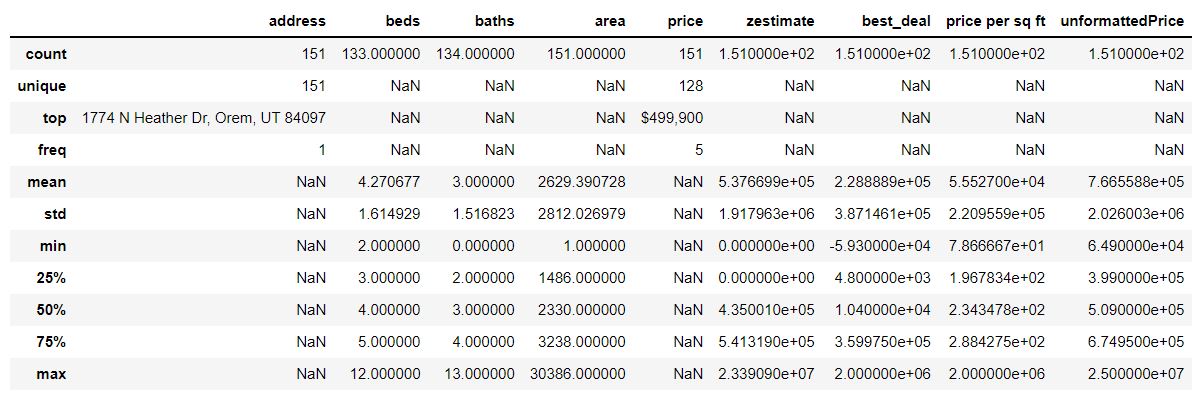
This quick command will give us the overview we want:
df.describe(include='all')
What this shows us is the table with everything broken down into quick number summaries to easily find specific indicators. For categorical data, this comes up as nothing.
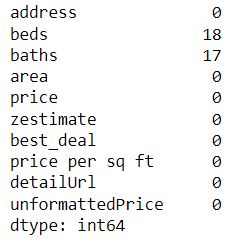
It is also smart to include a small code line to check for all null values just so you can get an idea of what is present and missing.
df.isnull().sum()
This will populate our results as such:
Visuals
A picture is worth a thousand words. Especially in the industry of numbers and statistics. Unfortunately, not everyone geeks out to numbers like you, so a nice picture will please the audience. Simply plot the data in a way that will represent something meaningful and aid you in your explanation. Make sure there are no exotic colors or unnecessary things going on.
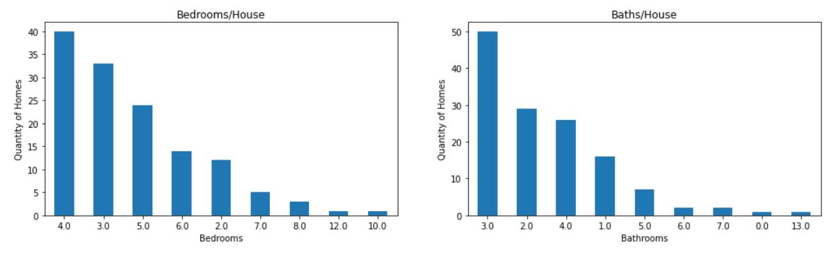 These plots simply show what the data table shows, but in a way that might be more engaging and telling for the audience. As we can see, the plots order them from highest to lowest. We can conclude that 4 bedroom and 3 bath is pretty common in the Orem, UT market.
More Visuals
Additionally, we can even look at density plots to see what is the most common square footage of homes in this example.
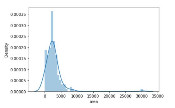 This plot indicates that the mean of the data is around the 2500 sq ft. mark. All of these visuals are really helping us understand what the numbers say.
Another interesting thing we can include is a correlation heat matrix.
corr = df[['baths','beds','unformattedPrice']].corr()
sns.heatmap(corr, annot=True, square=True)
plt.yticks(rotation=0)
plt.show()
Check out what this results in!!
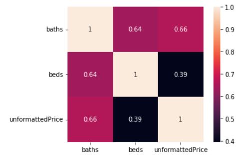
Looks like the correlation between baths and baths is perfect…jk, looks like the correlation between baths and price is the strongest. This makes us wonder if the more bathrooms there are is more valuable then bedrooms? Something to consider maybe??
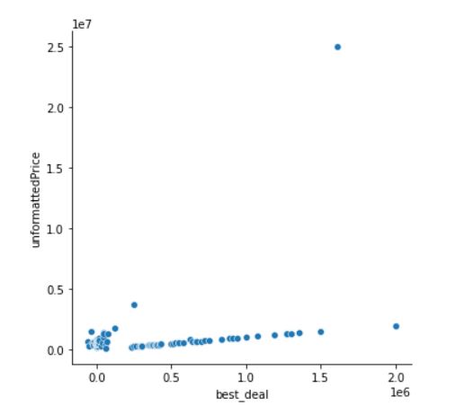
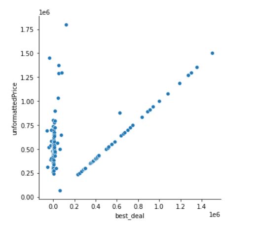
Outliers in Data
A lot of times we will get breaks in missing data or outliers. These simply ruin a nice visualization, and in a lot of cases are bumps along the way that we need to deal with. In my situation, I simply removed that piece of junk and decided to see what my visual looked like without it. Take a look:
Conclusion:
Make sure you implemeted this in your own code or followed along, the best part about this content is that is holds true. The basics of EDA will remain constant.
Here is a link to the code: GitHub Repo