
Present Data in a Legible Way
This blog outlines how to describe and present data to non-data scientists.
How to Present Data to An Audience
by Zack Driscoll
3 Key Things to Know Before Presenting Data:
As a data scientists, sometimes you get over excited when you finish your number crunching. At this moment you want to shout “eureka” and share it with the world, but you forget that not everyone can interpret what you can from data. When it comes to sharing your findings with the world, it is important to remember your audience. Not everyone understands what you might understand. For example, a p-value might mean nothing to someone who does not understand what a p-value indicates. It is imperative to understand how to translate your data to a reasonable language so that everyone can learn and apply your conclusions. Today you will discover 3 key takeaways that will immediately improve your presenting skills.
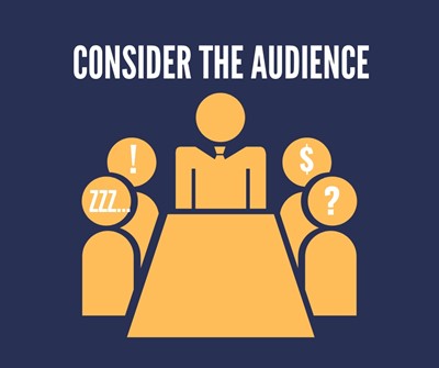
Know Your Audience
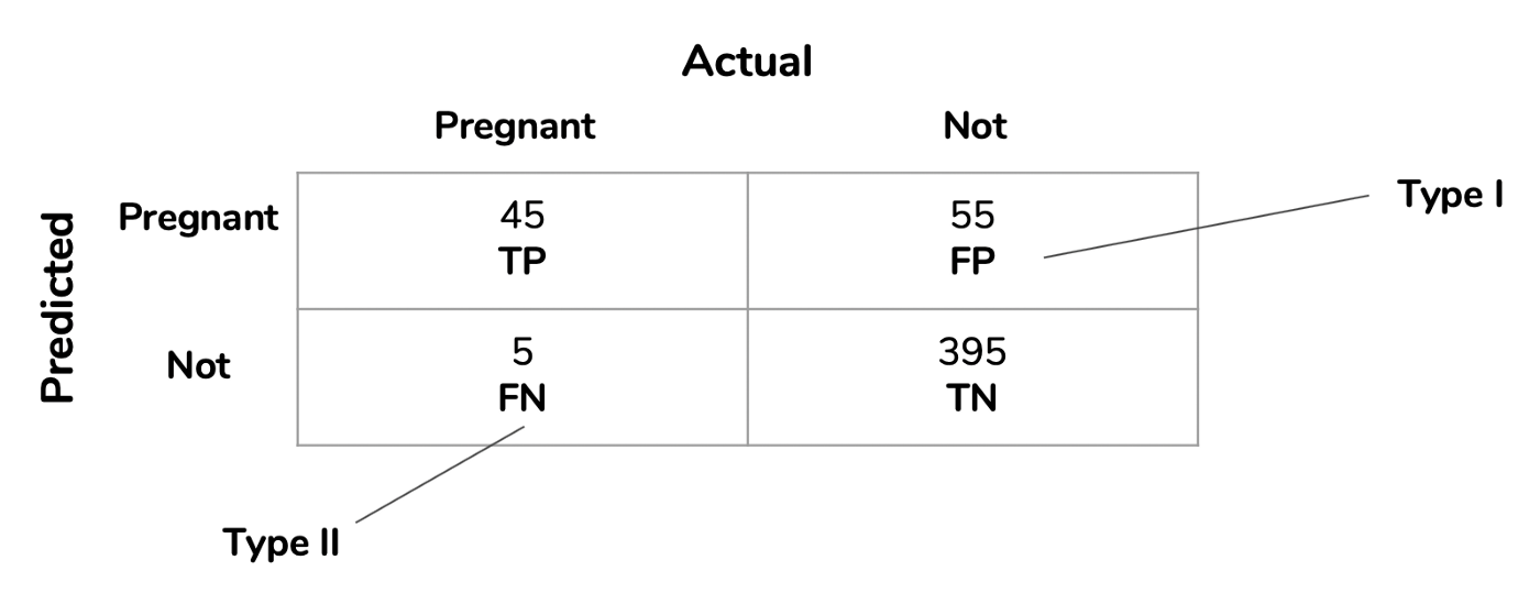
In this figure, you can see how a data scientist might breeze over type I or type II without explaining to someone what those actually mean
Imagine you are giving a huge presentation on an analysis that your boss wanted you to explore. You get through the whole thing and are beaming with excitement at the end, only to find that your boss asks you, “What does a coefficient of correlation mean?”. You soon realized that you had said that term over a dozen times throughout your explanation without really explaining what it is or what the value indicates. In reality, unless you understand what your audience’s limitations truly are, you might present it in a way that doesn’t make sense or doesn’t answer the intended question. The need to translate your code to understandable language is imperative. Knowing your audience means knowing the extent of their knowledge and what they will take away from the information you give them. If your boss understands what a standard deviation indicates, then you would not not need to explain that. On the reverse, if you are presenting to other data scientists, you can use chunks of code and terminology with limited explanation about the data being analyzed. Knowing your audience is the key to transmitting your insights and implementing them into day to day life.
Visualization
The number one way to grab interest and hold it is through visuals. We live in a day and age where the technology that we have access to can produce intricate graphs and visuals. BEWARE, do not rely soly on graphical information to relay the message. In some cases, the information displayed on a graph is just as illegible as a chunk of code to some people. It is important to have designs that are understandable and have a clear explanation of what each visual is indicating.
Figure 1a.
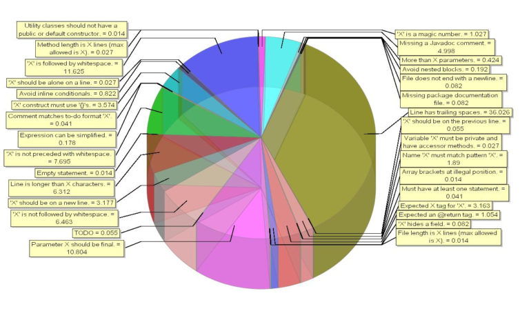
1a. This graph clearly is not an ideal visualization, and most everyone would get lost looking at this without being able to draw any conclusions
Figure 1b.
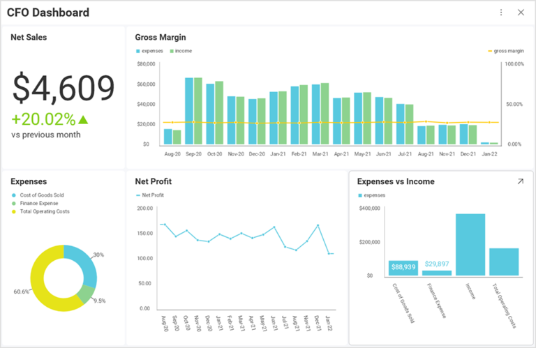
1b. This graph clearly indicates good titles, helpful coloring, and legible conclusions that can easily be explained
The comparison between figure 1a. and 1b. is daunting. Pie charts should not have more than 4 categories. There is also no need to have an sort of 3D effect, as it will not add any value in most cases. Sometimes, what you think might be a clear and precise visual might actually not serve well at all. In your presentations, you need to consolidate and make simple. Visuals can enhance your presentation or detract, depending on how they are utilized. Bar graphs are great examples of easy to read charts for a novice audience. The key to implementing this second step, is acing the first step of understanding your audience.
True Meaning and Application
Lastly, the information you share has to be relevant to people lives or there will be no lasting effect. A story has to be painted, and the value has to be there. The real question that people are wondering during a presentation is, how will this apply to me or life? Make sure that each presentation give, there is meaning and direction behind it.
Conclusion
Don’t forget these 3 critical points:
- Know your audience
- Visualization
- True Meaning and Application
The combination of these three powerful tools will make your average presentation become stellar. You will gain more followers and impact a wider audience. Leave a comment below with ideas on how to improve data presentations!!
For more ideas, check out: